Monday 30 November 2015

Grade 11/12 Art - Day 54 "ISU Introduction"

During the ISU process, there are multiple items that need to be handed in, both over the course of the project, and on the final deadline (which for this semester will be due on Thursday, Jan. 26.) These are the items required for a Visual Arts ISU:

Over the course of the project: 

1. ISU Concepts: This, as the title suggests, is a listing of concepts. Its purpose is to quickly sum up a list of possible ISU topics, and for grade 11/12, a minimum of five different topics are required. Thumbnails (small sketches) are highly recommended. (Meeting with the teacher will be ten times smoother with thumbnails.)

Teacher: “Begin by thinking of 5-7 ideas / concepts you’d like to explore for you ISU. Conduct research on each of these concepts, with a particular focus on artists who have done similar work before. Also begin thinking about how to “personalize” these concepts, so that they are meaningful to you. You will meet with the teacher to discuss your ideas, so be prepared to show thumbnail sketches and research images. It is important that you be able to justify why you want to do something, and how the work will be meaningful and original.”
2. Proposal: After a topic is chosen from the ISU Concepts, students are expected to expand on the topic. Though you may think “Oh, it’s only a proposal,” it’s a very important part of the ISU (and worth quite a bit of your final mark), so make sure to spend some good time on it. The Proposalmust be written according to the following guidelines:
A. Concept
1. Rationale: What do you want to do for your ISU and why do you feel this is an important and worthwhile task to take on? What will this piece of work “add” to your portfolio?
2. Theme: What are some possible subjects/themes/concepts that you wish to address in your series of work? How did these subjects/themes/concepts come up in your “brainstorming” session? Which questions prompted you to come up with your idea?
3. Subject Matter: Explain how you will explore your subject/theme/concept in your series of work. What is the artistic problem/concerns you wish to address (content: ideas related to theme, sub-topics, different ways it can be explored. stylistic: elements/principles, composition, approaches [controlled vs. painterly, etc], and artists or artistic movements that will serve as inspiration.technical: media and techniques)

B. Media/Materials/Dimensions: What is the media (area of traditional or non-traditional arts) that you would like to work in? What are the materials that you require? Where can these materials be accessed and what are any additional costs required? What are the dimensions of your piece?

C. Timeline: How long will the work take to complete? When are your projected completion dates? Include a calendar outlining your specific daily goals.
D. Research/Mentor:
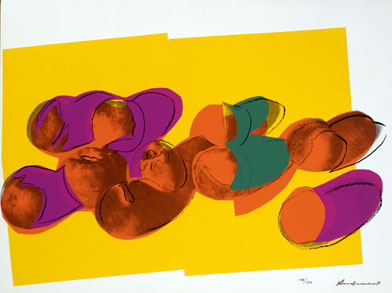
Research: Include images with names of artists/explanations of work that you may use as inspiration. You must cite all sources, so include a bibliography.
Mentor: Who can serve as a mentor to you during this process?

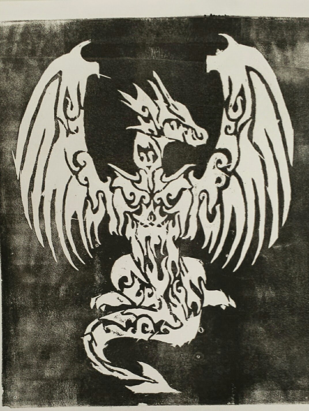
E. Thumbnails: Include at least 10 thumbnail sketches to illustrate your ideas.
3. ISU Process Check: This is the Visual Art’s equivalent of a Mid Point Proposal. Essentially it’s a short meeting with the teacher in the middle of the ISU timeline. The teacher will record what’s been done (or what hasn’t been done), give suggestions, and either tell you that “You’re too slow, you need learn to work faster,” or “This is good, you’re making progress. Keep it up.” Obviously, the latter feedback is preferable.
Teacher: “The unit will be marked in its preparatory stages as well as when the work the work is completed. If the work is being carried out in a way that cannot be evaluated, you must give detailed sketches and notes regarding its process. Select materials to suit style, technique and budget. Have all materials ready for use, work should not be delayed because of unavailable materials.”

On the final deadline:
*The funky thing with Visual Arts is that there’s no single final deadline. Each of the final deadline items have individual deadlines, which is nice because it helps you organize and see when each item is priority.
4. Final Product: This is the most important part of the ISU: the end product, the thing that’s been made as a result of the ISU learning process. The form of the final product will depend on the ISU topic.
5. Process Binder: The process binder is a comprehesive booklet of the ISU, summarizing the step-by-step process culminating to the final product. It usually includes the following, give or take a few headings: Concept (as seen in the ISU Proposal), Inspiration, Resources/Mentors, Thumbnails, Materials/Scale, Process, Final Product, Conclusion, and Works Cited. Sometimes creating the process binder can be as challenging as the actual ISU; it’s not something to be ignored until the last minute.
6. Formal Presentation: This is a 10-15 minute presentation with the teacher. The Visual Arts Formal Presentation is an overview of the ISU.


LEVEL 4 CHECKLIST!!

- The student shows good commitment in using his or her own artistic processes.

- The student generally demonstrates curiosity, self-motivation, initiative and a willingness to take informed risks.

- The student is generally receptive to art practices and artworks from various cultures, including his or her own.

- The student reflects critically and in depth on his or her artistic development and processes at different stages of his or her work.

- The student carries out an excellent evaluation of his or her work. This shows a considered appraisal of the quality of work produced and details of improvements that could be made.

- The student intentionally uses feedback in his or her artistic development, which shows an appropriate consideration of his or her artistic processes.

- The student is able to elaborate an idea, a theme or a personal interpretation to a point of realization. There is evidence of purposeful expression and effective communication of artistic intentions.

- Skills and techniques are applied at a high level of proficiency. The student shows an excellent ability to apply the artistic processes involved in creating art.

- The student is able to demonstrate excellent knowledge and understanding of the art form studied in relation to societal or cultural or historical or personal contexts.

- The student is able to demonstrate excellent knowledge and understanding of the elements of the art form studied.

- The student is able to communicate a well-developed critical understanding of the art form studied, in the context of his or her own work.

Grade 10 Art - Day 53: Warm and Cool Colours

Our curriculum document asks us, “Given that warm colours appear to come forward and cool colours recede, where might you best use cool colours in your portrait?”

To answer this question, we should review what warm and cool colours are.  The Andy Warhol Museum defines Temperature in the following way:

Temperature: (warm and cool colours): a colour's perceived sense of warm or coolness.  Aggressive (warm) colours: reds, oranges, and yellows.  Receding (cool) colours: greens, blues, and violets.

Today we will go this website: http://www.artistsnetwork.com/articles/art-demos-techniques/color-temperature-painting-demonstration

Here is the information I want to pass on to you:

Painting Demonstration | Color Temperature Creates Depth and Form


Giving attention to color temperature subtleties in your paintings can make a big difference in your spatial illusions of depth and form.


In the illustration above, notice that the warm, red circle appears to advance, or come forward, on the picture plane while the cool, blue circle appears to recede or go back in space. This is because the wavelengths of warm colors are longer so your eyes see them sooner than the shorter wavelengths of cooler colors. Using warm colors in the foreground of a painting and cool colors in the background of a painting can help create the illusion of miles of distance in a landscape and of a more shallow depth of space in a still life painting. The illusion of advancing or receding also helps create a sense of form.
The following demonstration shows how color temperature can be used to create the illusion of depth and form in a painting.

1. Right from the start, I used color temperature to create the illusion of depth by painting a cool background and using cool colors in the areas of the white drapery that recede toward the background and into the shadow areas. Specifically, I used mixtures of Payne’s gray dulled with cadmium scarlet and then mixed with titanium white. The areas of the drapery that have light on them and that are near the front edge have some Naples yellow light added to the titanium white. By warming those areas, they not only appear to be in the light, but they also appear to advance.

2. Here I’ve begun painting the fruit. The pear is a lot warmer on the side where the light is striking and cooler in the shadows, which creates the illusion of light and form. The same is true of the red plums. Using cadmium yellow, I warmed the area of the lightest plum—the one farthest forward and closest to the light—making that area seem to advance. The areas of shadow are cooler, adding to the illusion that they are receding, which also contributes to the illusion of form. These warm and cool temperature differences were not what my reference material showed me, but because I understood principles of color temperature, I was able to make adjustments. (In addition to temperature, I used value to create the form.) Temperature also helps convey spatial relationships. The plum on the right is a bit behind the other plum. That illusion arises in part because the front plum overlaps the back plum, but the fact that the back plum is cooler than the front plum also helps.

3. Here you can see that I changed the background to a warm, neutral color of the same value as the previous cool background. When you compare this image with the previous one, you can clearly see how the cool background recedes easily behind the fruit and drapery while the warmer one pushes forward, competing for the space where the fruit is.

Here you see the finished painting Pear and Plums (oil, 8×10) with blush added to the pear and frost added to the plums. The addition of these final details adds to the realism of the fruit. The warm red blush on the pear makes that part of the pear advance even farther and makes the form look even more dimensional.
Summing up, warm colors seem to advance while cool colors seem to recede, and you can use this knowledge to create the illusion of form and depth of space.

Grade 11/12 Art - Day 53


In a bizarre series of events, we have not completed the previous days lectures so I will be going through those with you today.  It will also give us a chance to catch up on any outstanding studio productions.  Stay tuned!

Friday 27 November 2015

Nursery Room Safari Art

A Little Bit of Art by Me


As of late, I've been in the very awesome position of having to decorate a nursery for my first child. I decided to employ my art skills to achieve this task.  I started by drawing some cartoons of animals from the internet. I started with actual photographs and reduced them to cartoons like these.


After that was completed, I bought a 4 x 8 sheet of MDF and proceeded to draw my cartoons on a larger scale.  They were then cut out and the first layers of paint were added.  An important note is that I painted my early layers in sweeping motions that followed the outline of the animal.  This creates a texture that I can use to shade in value transitions, as you can see in the final pics.  Thanks for having a look!


Thursday 26 November 2015

Grade 9 Art - Day 53: "Warhol, Session 2...Pop Art Presentation"


Today, we will be working through the Pop Art powerpoint presentation found at the following link!

https://drive.google.com/open?id=0BzqP9A0c989nMERTQnM0anI4Um8

Grade 11/12 Art - Day 52 "Famous Prints, Session 1"

Katsushika Hokusai's "The Great Wave at Kanagawa"

From Metropolitan Museum of Modern Art:

The preeminence of this print—said to have inspired both Debussy's La Mer and Rilke's Der Berg—can be attributed, in addition to its sheer graphic beauty, to the compelling force of the contrast between the wave and the mountain. The turbulent wave seems to tower above the viewer, whereas the tiny stable pyramid of Mount Fuji sits in the distance. The eternal mountain is envisioned in a single moment frozen in time. Hokusai characteristically cast a traditional theme in a novel interpretation. In the traditional meisho-e (scene of a famous place), Mount Fuji was always the focus of the composition. Hokusai inventively inverted this formula and positioned a small Mount Fuji within the midst of a thundering seascape. Foundering among the great waves are three boats thought to be barges conveying fish from the southern islands of Edo. Thus a scene of everyday labor is grafted onto the seascape view of the mountain.

Grade 10 Art - Day 52 "Stencil Printing"

To continue building upon our understanding of printing techniques, I wanted to talk about Stencil Printing.

From Saffron Art:

"Screen printing, also known as stencil printing, involves the passing of ink or any other printing medium through a stencil, which has been applied (or exposed) onto a mesh or ‘screen’ that has been stretched on a wooden or metal frame. The exposed areas of the stencil allow the ink to flow though the screen onto the paper or fabric that lies directly below it. The blocked or unexposed areas on the screen do not allow the ink to penetrate and the parts of the paper or fabric that lie beneath these blocked areas remain in their original colour.


The Chinese first used screen printing almost 2000 years ago. At first, human hair was stretched across a wooden frame to create a screen. The stencils used then were not applied to the screen using photosensitive material, as it is today. Instead they were made of leaves of different shapes and sizes stuck together and attached to the back of the frame.

When the Japanese adapted the technique a few years later, they used woven silk to make the mesh screens and lacquer to make stencils. This is how screen printing got its alternative name – silk screening or silkscreen printing. Here, ink was applied to the screen with the use of a squeegee (a rubber plane held in a rigid handle). The squeegee enabled the ink to be spread across the frame evenly. The excess ink would collect at the bottom end of the frame from where it was collected and reused.

Samuel Simon, an Englishman who lived near Manchester, patented the first ever industrial screen printing process in 1907. Many years later, John Pilsworth invented the Selectasine method, which allowed multi-colour printing using the same screen. Different areas of the screen were blocked out for each colour in the design, resulting in a multi-coloured image.

Today, with the advent of modern technology including electronics and computers, screen printing has come a long way. Although the basic technique remains the same, it is no longer recognized as the technique patented by Simon in 1907.

Pop artists of the 1960s, such as Andy Warhol and Roy Lichtenstein, greatly popularized the process of screen printing through their work. Although the stencil processes were initially not as popular as relief and intaglio in India, the techniques soon caught on and are frequently used by artists like K.G. Subramanyan, Anita Dube, Bose Krishnamachari, Nataraj Sharma, and A. Balasubramaniam.

Serigraphs are silkscreen prints of original masterpieces made in collaboration with the artist and editioned and signed by them. Initially, serigraphs were referred to as ‘the next best thing’ for art lovers who could not afford an original masterpiece. However, more recently, art collectors have also been showing a keen interest in signed, limited edition serigraphs."
Source: http://www.saffronart.com/sitepages/printmaking/stencil.aspx

Grade 9 Art - Day 52 "Warhol Task Results + Warhol Lesson Plan, Session 1"

The grade nine class did a good job learning the definitions related to printmaking from the Picasso Printmaking app.  We then had some fun with the Pop Art Lite app.  Here are some results:


In today's lesson, we visit Andy Warhol's website and learn more about colour terminology.  Our lesson can be found at http://www.warhol.org/education/resourceslessons/Lesson-1--Silkscreen-Printing/

I will handout the colour terminology resource.  If you are not in class, here it is:

After reviewing the terminology, we will learn how Warhol got from a photo to a finished print, found at this link: http://exhibitions.warhol.org/interactive/silkscreen/main.html


Next class, we will go through a Pop Art powerpoint presentation!


Wednesday 25 November 2015

Grade 11/12 Art - Day 51 "Masks"


Masks are one of the oldest forms of art and sculpture, with examples dating to 7000 BCE.  They have served many purposes over the years such as rituals, costume parties, and theatrical props.

Today, we will explore http://www.historyofmasks.net/ to get a better idea of the many purposes and the history associated with masks and mask-making.  


Grade 10 Art - Day 51: "Intaglio"

Marcantonio — Portrait of Pietro Aretino, detail

Intaglio

In intaglio printing, the lines to be printed are cut into a metal plate by means either of a cutting tool called a burin, held in the hand – in which case the process is called engraving; or through the corrosive action of acid – in which case the process is known as etching. In etching, for example, the plate is covered in a resin ground or an acid-resistant wax material. Using an etching needle, or a similar tool, the image is engraved into the ground, revealing the plate underneath. The plate is then dipped into acid. The acid bites into the surface of the plate where it was exposed. Biting is a printmaking term to describe the acid's etching, or incising, of the image. After the plate is sufficiently bitten, the plate is removed from the acid bath, and the ground is removed to prepare for the next step in printing.

To print an intaglio plate, ink is applied to the surface by wiping and/or dabbing the plate to push the ink into the recessed lines, or grooves. The plate is then rubbed with tarlatan cloth to remove most of the excess ink. The final smooth wipe is often done with newspaper or old public phone book pages, leaving ink only in the incisions. A damp piece of paper is placed on top of the plate, so that when going through the press the damp paper will be able to be squeezed into the plate's ink-filled grooves.The paper and plate are then covered by a thick blanket to ensure even pressure when going through the rolling press. The rolling press applies very high pressure through the blanket to push the paper into the grooves on the plate. The blanket is then lifted, revealing the paper and printed image.
Source: wikipedia

Grade 9 Art - Day 51 "Warhol Images using Pop Art Lite"


In today's class we will be having some fun with apps related to printmaking.  The first app I want you to download is Picasso Printmaking which can be found at this link:

https://itunes.apple.com/ca/app/picasso-printmaking/id511887972?mt=8

We will run through the app and follow the learning processes embedded in it.  I would like you to write down the definition to the following terms, which will then be submitted as part one of your ticket out the door:

- relief
- intaglio
- dry point
- etching
- aquatint
- lithography

In the second half of the class, we will be doing Warhol selfies.  Here is a famous print of Marilyn Monroe done by Andy Warhol:


Using Pop Art Lite, you can import a selfie from your photo file and adjust it to make it as much like Warhol's work as your would like, and then share it with me!  Here is a link to the app:

https://itunes.apple.com/ca/app/pop-art-lite/id320338807?mt=8

Please email your finished "Warholian Selfies to joshmccl@fc.amdsb.ca."

I will post some of your results next blog for this class!

Grade 11/12 Art - Day 50 "Wire Sculpture"

Sculpture by Ian Lovatt

The use of wire to create sculptures is a largely recent movement.  By recent, I mean the 20th century.  Pioneers of this movement took contour line drawings from the 2D plane of a sketchbook to the 3D world of infinite space.

There are a few famous names I would like to discuss:

Alexander Calder

Calder was a major innovator in the use of wire for sculpture.  Let's visit his web site to view a photo-biography of his life and work.

http://www.calder.org/life/photobiography

A further analysis of wire sculptors can be found here:

http://infomory.com/famous/famous-wire-sculpture-artists/

Tuesday 24 November 2015

Grade 10 Art - Day 50 "Planographic and Relief Printmaking"

Printmaking Techniques - Planographic and Relief


Planographic - lithography: a drawing is completed on a smooth block of limestone using a grease pencil. The stone is treated with nitric acid and gum arabic, cleaning and etching the stone. Water is then sponged on the block. Ink is rolled on the stone, accepted by the greased areas. I dampened sheet of paper is then placed on the block which then undergoes a scraping process of the lithographic press. The results can be quite extraordinary. Here is an example, taken from Fox Talbot's "Pencil of Nature":


The second medium we discussed today was the Relief process, in particular the woodcut. An artist draws an image on a wooden block. The printmaker then gouges away the area that will not receive ink for the final print. If the paper is white, the printmaker gouges away the white areas in varying degrees. The block is then rolled with ink using a brayer, and then pressed in a printing press. Here is an example, entitled "East Side New York", by Albert Potter:


Tomorrow: The Intaglio Process and The Stencil Process.

Grade 9 Art - Day 50 "Soy-Based Ink Print"


In today's class, we begin our printmaking unit using Akua Intaglio ink.  This product is soy based, slow drying, and is easy to clean up with just soap and water.

We will roll the ink onto a sheet of Lexan using a brayer. We then remove the ink that we do not want to print onto our paper.  This ink takes days to dry on the Lexan so there is no rush to run it through the printing press.  Here is an example from a previous student that used this ink.


Monday 23 November 2015

Grade 10 Art - Day 49 "Intro to Print Making"


Printmaking

Printmaking may be one of the first forms of art that people are introduced to. Often, a baby's footprint is taken at the hospital. As a toddler, we may be introduced to simple printmaking with vegetables, fingerprints, or other objects in pre-school. Printmaking as a form of art goes back many centuries, but may best be traced to the early textile prints in 5th century China or the woodcut prints in 14th century Germany.

Here is the "Buxheim St. Christopher" print dating to 1423.


At the dawn of the Renaissance, artists called for finer lines and detail in their prints, so a technique of printing from metal, rather than wood blocks, came into fashion. These "Intaglio" prints demonstrated a master of the etching techniques that date to the mid-fifteenth century. Albrect Durer, of the North Renaissance movement, was particularly masterly in his work, as exemplified by "Melencolia I", seen below.


As a review, is a description of the work, taken from www.ivc.edu:

"Made in 1514 and titled Melencolia I, the engraving became one of the most famous of Albrecht Durer's prints. Although Albrecht Durer produced many prints throughout his life, his Melencolia I became one of his most famous prints. The engraving became a representative of modern thinking, and has been researched and studied by many people before. The title of the engraving is written on it on the top, left-hand side. The print shows a figure sitting, in the edge of the image, in a room surrounded with many different scientific, and mathematical tools. Sitting on a wheel next to the figure is a baby angel. Some of the mathematical tools that in the print include a compass, a scale, magic square, an hourglass, a geometric solid. The magic square says has the date that the print was produced, 1514. When the numbers on the magic square are added, from any row (horizontally, vertically, or diagonally) the result is always the number 34. There were many interpretations on the meaning behind the scene in the engraving. The most famous interpretation is that the figure in the image is trying to invent something genius. Because the figure is unable to invent something, he sits hopeless and depressed, creating the melancholic mood of the picture from which its name is derived."

Progressing through history, multi-coloured block printing gained its own movement in Japan in the mid-1700s such as Katsushika Hokusai's "The Great Wave at Kanagawa".


Modern techniques vary, but are firmly rooted in various applications throughout history. We focus primarily on the woodblock relief, utilizing MDF board as our printing block. Here is an example of the print that Meryn Lobb made in this class:


Grade 11/12 Art - Day 49: Laocoön and his Sons

In today's session, I wanted to turn back the clock a bit to the early first century.  We will watch and discuss this video on fascinating sculpture, housed in the Vatican museums.


Friday 20 November 2015

Grade 10 Art - Day 48 "Safe Use of Materials"

Why is it important to know about the toxicity of art materials? 

In the artist's studio, many dangerous chemicals may be found.  It is important to consider the toxicity of art material so that you may protect yourself when using them and respond to a potential first aid scenario that may arise from working with said materials.

Let's talk about spray paint as an example of a commonly used art material.  For this example, I grabbed a can of Rust-oleum "Painter's Touch", a fast-drying oil-based spray paint readily available at hardware stores.

The can comes with immediate warning symbols as to its contents.  They look like this:


If you are not familiar with these symbols, they will mean nothing to you.  Therefore, I include he following symbol explanations for your reference:


After reviewing this chart, you can see that the contents are flammable, toxic (or poisonous), and explosive!! Most of this information can be found on the side of the can.  However, if you want even more detail you can visit the website of the manufacturer to read the safety data sheets (MSDS) on safe use of this product:

After viewing the safety data sheets, it is easy to see why precautions are necessary when working with this product!!

Remember, this is only one product that may be found in an artist's studio.  Familiarize yourself with the products that are available to you...so that you may lead a long, healthy life!


Grade 9 Art - Day 49 "Cultural Symbols and Characters"

In today's class, we will be examining a symbol or character from another language or culture.  Let's start with a little history.

As humans, our system of communication is unique on this planet in the way that we communicate using symbols.  Be it letters, words, kanji characters, or graphics, we can communicate our thoughts in a variety of powerful ways.

Your task today is to pick a word that is important to you.  Perhaps it's "Hope" in the face of adversity, or perhaps "Acceptance" in response to race-based events in our world.  Whatever your word is, I want it to have meaning to you personally.

Using your iPads, research symbols from other cultures that are used to communicate your word!

Here are some examples:


Using materials found in this room, I want you to pretend that you are a graphic designer. You can take your symbol and weave it into a mixed-media creation of your choosing.

It might be a good time to review the steps of the creative process (see white board) as you complete this task for your design company. Good luck!

Grade 10 Art - Day 47 "Interpreting Art"

In today's class, we will do an art interpretation assignment.

Let's first view the painting in question:


Here are the questions we face from our curriculum document:

  1. What do you think was the purpose of Edouard Manet’s Le Déjeuner sur l’Herbe? 
  2. What aspects of the style or content of the painting support your opinion?
After our discussion, we will review this description of the painting from the Musee d'Orsay:

"Rejected by the jury of the 1863 Salon, Manet exhibited Le déjeuner sur l’herbe under the title Le Bain at the Salon des Refusés (initiated the same year by Napoléon III) where it became the principal attraction, generating both laughter and scandal.

Yet in Le déjeuner sur l'herbe, Manet was paying tribute to Europe's artistic heritage, borrowing his subject from the Concert champêtre – a painting by Titian attributed at the time to Giorgione (Louvre) – and taking his inspiration for the composition of the central group from the Marcantonio Raimondi engraving after Raphael's Judgement of Paris.But the classical references were counterbalanced by Manet's boldness. The presence of a nude woman among clothed men is justified neither by mythological nor allegorical precedents. This, and the contemporary dress, rendered the strange and almost unreal scene obscene in the eyes of the public of the day. Manet himself jokingly nicknamed his painting "la partie carrée".

In those days, Manet's style and treatment were considered as shocking as the subject itself. He made no transition between the light and dark elements of the picture, abandoning the usual subtle gradations in favour of brutal contrasts, thereby drawing reproaches for his "mania for seeing in blocks". And the characters seem to fit uncomfortably in the sketchy background of woods from which Manet has deliberately excluded both depth and perspective. Le déjeuner sur l'herbe - testimony to Manet's refusal to conform to convention and his initiation of a new freedom from traditional subjects and modes of representation - can perhaps be considered as the departure point for Modern Art."


Grade 11/12 Art - Day 48 "Michelangelo's Sculptures, Session 3"

Michelangelo's David

Photo source: Stanford University

Too often, we view David from a full-frontal point of view.  However, the art student is well-served to view David from what has been traditionally the right side.  From this angle, which is really the "front", we see the glare that he is throwing at Goliath!


"When we view from the proper angle, we see a very different David.  From Dr. Pietro Antonio Bernabei of the Careggi hospital in Florence and Prof. Massimo Gulisano, an anatomist at Florence University, recently announced that every detail of the sculpture "is consistent with the combined effects of fear, tension and aggression," (Hooper, 2005). According to an interview with Bernabei, everything is "consistent with a young man 'at the moment immediately preceding the slinging of a stone.' His right leg is tensed while the left one juts forward 'like that of a fencer, or even a boxer.' Tension is written all over his face. His eyes are wide open. His nostrils are flared. And the muscles between his eyebrows stand out, exactly as they would if they were tightened by concentration and agression." These features of the sculpture are best appreciated in terms of the long-lost frontal view newly depicted here. The tension of the moment even accounts, according to Bernabei, for "a contraction of the reproductive organs," which has puzzled many observers in the past."

Source: http://www.econ.ohio-state.edu/jhm/arch/david/David.htm

History

The statue of David was started by a different artist, Agostino di Duccio, in 1463. He picked out a rather narrow piece of stone, which was customary for artists of his denomination. If you are an art expert, you can see from the side that this is not a piece that Michelangelo would have picked. It is too thin.
Source: http://vlsi.colorado.edu/~rbloem/david.html

Agostino only got as far as beginning to shape the legs, feet and the torso, roughing out some drapery and probably gouging a hole between the legs. His association with the project ceased, for reasons unknown, with the death of Donatello in 1466, and ten years later Antonio Rossellino was commissioned to take up where Agostino had left off.

Rossellino's contract was terminated soon thereafter, and the block of marble remained neglected for 25 years, all the while exposed to the elements in the yard of the cathedral workshop. This was of great concern to the Operaauthorities, as such a large piece of marble was not only costly but represented a large amount of labour and difficulty in its transportation to Florence. In 1500, an inventory of the cathedral workshops described the piece as "a certain figure of marble called David, badly blocked out and supine." A year later, documents showed that the Operai were determined to find an artist who could take this large piece of marble and turn it into a finished work of art. They ordered the block of stone, which they called The Giant, "raised on its feet" so that a master experienced in this kind of work might examine it and express an opinion. Though Leonardo da Vinci and others were consulted, it was Michelangelo, only 26 years old, who convinced the Operai that he deserved the commission. On 16 August 1501, Michelangelo was given the official contract to undertake this challenging new task. He began carving the statue early in the morning on 13 September, a month after he was awarded the contract. He would work on the massive statue for more than two years. 

Source: https://en.wikipedia.org/wiki/David_(Michelangelo)
We will now view the Stanford 3D project of David using Scanview! It can be found at:
http://graphics.stanford.edu/software/scanview/ScanView-1.21-Installer.exe

Thursday 19 November 2015

Grade 9 - Day 48: "Careers in Visual Art"


We thoroughly explore the various careers that are available to you as a budding artist in the Grade 10 level class,  Today, however, I would like to begin this discussion to get your minds thinking toward the importance of art-related careers in society and how you could be preparing your portfolio already!

Here are the curriculum questions that I would like to explore with you today:
  • What careers can you think of that are related to visual arts? 
  • How could you go about expanding and varying this list? 
  • Would a college pathway allow you to enter all of these careers, or would some require a different pathway?”
Photo source: Melissa Mercilliott Society 6

Grade 11/12 - Day 47 "Michelangelo's Sculptures, Session 3"

The Medici Madonna


Photo source: wikiart

Building on yesterday's conversation of Madonna of the Stairs, here we fast forward 30 years in Michelangelo's life and revisit the theme of the nursing Christ-child and the "emotionally-unavailable" stare of the Madonna.  

If the sculpture seems unfinished to you, you're right.  It was originally meant to decorate the Old Sacristy building, designed by Brunelleschi and commissioned by the Medici family.  Michelangelo chipped away at it over many years, but when he moved to Rome it was moved to its current location in the New Sacristy.

It is fun to imagine Michelangelo planning this piece when, as a teenager, he completed the low-relief Madonna of the Stairs.  If you review yesterday's discussion, we contemplated the theory that Michelangelo was himself the well-muscled Christ-child, hiding under the robe of Mary, as a sculptor working away on his masterpiece.  In the Medici Madonna, Mary's eyes are similarly vacant, dispassionate about the events around her.  Again, the child is again faced away, hidden from view, trying to feed.  Mary seems to reject.  

It may be believed that Michelangelo was in this way still working.  However, this time it may be mentally and emotionally processing the relationship that he himself had with his wet-nurse.  This is alluded to in Rona Goffen's, "Mary’s Motherhood According to Leonardo and Michelangelo".  

The piece itself is visually stunning, demonstrating Michelangelo's masterly with carving marble to resemble draping fabric.  The principle of design that I want to focus on in this class is movement. As a group, we will discuss movement in this work and the rhythm that Michelangelo created.  

Grade 10 Art - Day 46 "Legal and Ethical Issues Wrap-Up"


To wrap up our three-day discussion on legal and ethical issues as they apply to visual art, I would like to review some of the important responsibilities you have as an artist, should you decide to borrow or appropriate materials.


  1. Seek permission before incorporating copyrighted materials in your art work; 
  2. Show respect for intellectual property; 
  3. Demonstrate sensitivity when using patterns or conventions from other cultures in their art work;
  4. Make sure that if you appropriate pre-existing work, that you re-contextualize the work so that your work is something new and the original.
At the end of the day, you may be far better served to approach your art in terms of true creativity: "develop a product, process, or idea by integrating original thinking with existing knowledge."
(AMDSB Strategic Plan)

I encourage you to find inspiration in the work of others, be it style, colour choices, or any other number of artistic variables.  Take what you like and weave it into your own, singular work...work that expresses your artistic voice.  

Easier said than done?  I encourage you to review the article below from ArtBistro:

Artists may work for a very long time, even a lifetime, and never quite find their artistic voice. They may know that their work isn’t really that fresh or interesting but not seem to possess the wherewithal to break through into deeply felt, personalized work. Here are ten tips for doing just that: for finding your voice as an artist.

1. Detaching from your visual library

A very common problem, and almost always an unconscious one, is the need an artist feels to make his work look like something he holds as “good art” or “real art””—very often Old Master art. Because he possesses an internal library of the successful artworks of well-known artists, without realizing that he is doing it he aims his art in the direction of those successes. It is vital that an artist detach from that visual library—extinguish it, as it were—so that his own imagery has a chance to appear.


2. Not resting on skills and talent

Maybe you excel at producing dynamic-looking cats or turning a patch of yellow into a convincing sun. That you have these talents doesn’t mean that you ought to be producing lifelike cats or brilliant suns. Your strongest subject matter and style choices are dependent on what you want to say rather than on what you are good at producing. By all means parlay your skills and talents—but don’t rely on them so completely that you effectively silence yourself.

3. Allowing risk-taking to feel risky

Very often the personal work you want to do feels risky to undertake. Intellectually, you may find the way to convince yourself that the risk is worth taking—but when you try to take the risk you balk because you suddenly feel anxiety welling up. Remember that a risk is likely to feel risky. Get ready for that reality by practicing and owning one or two anxiety management strategies that allow you reduce your experience of anxiety.

4. Completing for the sake of progress

When you make new work that you think is aiming you in the direction of your genuine voice, try to complete that work rather than stopping midway because “it doesn’t look right” or “it isn’t working out.” You will make more progress if you push through those feelings, complete things, and only then appraise them. It is natural that work that is new to you and a stretch for you may provoke all sorts of uncomfortable feelings as you attempt it. Help yourself tolerate those feelings by reminding yourself that finishing is a key to progress.

5. Thinking about positioning

You may want to develop your voice independent of art trends and say exactly what you want to say in exactly the ways that you want to say it. Or it may serve you to take an interest in what’s going on and make strategic decisions about how you want to position yourself vis-à-vis the world of “hot artists,” galleries, collectors, exhibitions, auctions, movements, and so on. It isn’t so much that one way is right and the other wrong but rather that some marriage of the two, if you can pull it off, may serve you best: some marriage, that is, of the intensely personal and marketplace strategizing.


6. Articulating what you’re attempting

Artists are often of two minds as to whether they want to verbally describe what they’re visually attempting. The paraphrase of a visual experience into a verbal “artist’s statement” often feels unconvincing and beside the point. On the other hand, it can prove quite useful to announce to yourself what you hope to accomplish with your new work. By trying to put your next efforts into words, you may clarify your intentions and as a consequence more strongly value your efforts.

7. Not repeating yourself for the sake of repeating

Repeating successful work has a way of reducing our experience of anxiety and can bring financial rewards as well. But it may also prevent us from moving forward and from discovering what we hope to say. A balance to strike might be to do a certain amount of repeat work, for the sake of calmness and for the sake of your bank account, and to also add the reality of new work to your agenda.

8. Revisiting your earliest passions

Life has a way of causing us to forget where our genuine passions reside. You may have spent decades in a big city and completely forgotten how much the desert means to you. You may have been so busy painting and parenting that your burning passion for creating a series of cityscapes fell off the map somewhere along the line. Finding your voice may involve something as simple and straightforward as making a list of your loves and starting those that still energize you.

9. Integrating your different threads

Maybe you make two sorts of art, abstract relief paintings and realistic flat paintings. This division may have occurred at some point when, perhaps without consciously thinking the matter through, you decided that the one painting style allowed you do something that the other didn’t. It may pay you to revisit this question and see if the two styles can be integrated into some third style that allows the best of both current styles to come together. Whatever you discover from that investigation—whether it’s to move forward in a new way or recommit to your current methods—you will have helped yourself better understand your artistic intentions.

10. Accepting never-before-seen results

It can feel odd to speak in your own voice and then not recognize the results. Because what you’ve created may be genuinely new—and completely new to you—it may look like nothing you’ve ever seen before. That can prove disconcerting! Don’t rush to judge it as too odd, a mess or a mistake, or not what you’d intended. Give it some time to grow on you and speak to you. Your own voice may sound unfamiliar to you if you’ve never heard it before!

Wednesday 18 November 2015

Grade 9 Art - Day 47: "Analyzing Your Own Problem Solving Skills"

I want to pose this question to you today, which is taken from our curriculum document:

“Describe how you have used your creative problem-solving skills in a situation that was not related to making or looking at art.”

This involves us thinking outside of the box - in this case the box is our classroom!  I wanted to pose a few methods of solving your problems creatively.

  • The tried and true problem solving method:
  • Mind-Mapping
  • Collaboration
  • Trees!  (TRIZ) (I will explain, but it looks like this):

These are just a few examples!  I am excited to hear how you solve your problems creatively.  I wanted to end our discussion with the following chart that really captures a lot of what we are talking about it here.  This chart shows how all of our problem solving approaches are inter-related and centre around wellness!


Sources: 

http://www.adolescentwellness.org/wp-content/uploads/2011/06/Bubble-Reilly.jpg,  and
www.kent.ac.uk

Grade 10 Art - Day 45, "Intellectual Property"

Building on our conversation yesterday about appropriation and plagiarism, I wanted to introduce you to the term intellectual property as it relates to visual art.

Intellectual property is defined as: "property that results from original creative thought, as patents, copyright material, and trademarks." (dictionary.com)

As an artist, you need to be mindful of how your creations are your own intellectual property!

Here is an excellent Ted Talk that speaks to the concerns surrounding copy-written material and intellectual property.  We will watch this video and discuss as a class!


Grade 11/12 Art - Day 46: "Michelangelo's Sculptures, Session 2"

Madonna of the Stairs


Believed to be one of Michelangelo's earliest works, completed in or around 1491, Madonna of the Stairs is a sculpture created in the rilievo schiacciato technique.

Rilievo means relief, and schiacciato means "low" or "compressed".  Donatello is most famous for using this technique and it is not believed that Michelangelo used this technique again.  

The Madonna of the Stairs was created when Michelangelo was a teenager.  It combines chiseled lines that are similar to a drawing, and carved away portions that are sculpted.  

Taken from Simon Abrahams', "Michelangelo: Madonna of the Stairs":

"Michelangelo’s first truly mysterious work was made during his teenage years, the Madonna of the Stairs (above). Despite its small size, the young sculptor’s imagination was already working on a colossal scale. Yet even at first sight the scene looks strange, an immediate barrier to understanding that decades of scholarship has done little to dent. Why, for instance, does Christ have his back turned and why is he so muscled? What are the stairs for? Why is the nursing Virgin so impassive? The answers appear, and the incongruities resolve, only if one tries to think through Michelangelo’s mind."

It is here that I want to pause and have you consider the following words from Abrahams' analysis carefully.  We will discuss this excerpt as a class:

"Michelangelo’s Christ-soul in the Madonna of the Stairs faces away from us because, hidden under the veil of normal perception, he is hard at work carving a colossal statue of the Madonna. That hand, curled behind his back, grips an unseen hammer and will soon come over his shoulder to strike the “sculpture” of the Virgin with force. This, in turn, explains her inanimate expression. She is “stone” while he is active and “alive”.  Moreover, this is said to be almost the first time in art that the Virgin and Christ’s gazes are not linked in some way. By not linking them Michelangelo signals that the two figures are indeed in separate realities: one sculpture, the other sculpting. The third principal figure, Christ/Michelangelo’s alter ego on the steps, also “chips away” at the Madonna’s figure using the stairs to reach her face as a sculptor might use a ladder. Doubling, like the double self-portrait in Jeremiah’s beard and those revealed in Balas’ Michelangelo’s Double Self-portraits, is a common feature in his work. Here, even as infants, Michelangelo presents himself in duplicate. His double on the stairs stretches an arm to hold himself up while the other actively links him to the Madonna. As an archetype, stairs or a ladder (eg., Jacob’s Ladder) indicate the approach towards a higher state of consciousness: above and beyond is fame, glory, and divinity. Christ moreover is placed at the Virgin’s breast, then a rare scene in Florentine art, because on a mystical level Michelangelo gains his power as a supreme artist by imbibing the Virgin’s milk. Indeed he later claimed that the source of his genius was the stone-dust in his wet nurse’s milk: he said she had been a stone-mason’s wife. He used the same basic idea in the Medici Madonna (below)":


Michelangelo, Medici Madonna (1521-34) Marble. San Lorenzo, Florence.

Written source: http://everypainterpaintshimself.com/essay_pdfs/MichelangeloStairs2.pdf