Friday 18 December 2015

Grade 10 Art - Day 64: "Visual Literacy - See and Describe, Pt. 3"


Assignment Part Three: The last part of this writing assignment calls for you to describe a 1988 painting by Faith Ringgold, Dancing on the George Washington Bridge (Acrylic on canvas, printed and tie-dyed fabric, 68" x 68"). Think about the self-assessment you did in Part Two of this writing assignment. What aspects of description do you think you could improve on? Work on those in this writing assignment. Remember that you want to describe everything the artist has done or included in the artwork and you want to describe it in a way that someone could "see" the work even if they weren't able to view it. You should write 200 words, in essay format.

When you have completed writing your description of Dancing on the George Washington Bridge, reread it, compare it to the painting, and then in four or five sentences write what aspects you think you have described particularly well and what aspects of description you think you still need to work on.
Lesson Inspired by: Elsa Barkley Brown, Departments of Women's Studies and History, University of Maryland

Grade 9 Art - Day 64: Visual Literacy Session 4, "Juxtaposition, Part 2"

Continuing our discussion of juxtaposition, I wanted to hear your thoughts on the following comparison.

The following paintings are paintings of Jesus as he is traditionally portrayed in Western culture.


Now, I would like to preview this article from popular mechanics at: http://www.popularmechanics.com/science/health/a234/1282186/

This photo, from that site, used forensic facial construction to give an accurate portrayal of what Jesus could have looked like.  I am eager to hear your thoughts on this juxtaposition!


Grade 11/12 Art - Day 64 "Science to the Power of Art, with Zachery Copfer."

In our ongoing discussion of the melding of science and art, I want to introduce you to the work of Zachary Copfer.  Let's begin with his Ted Talk:


Then we will preview his work at:

http://www.sciencetothepowerofart.com/

And check out these videos...art grown in bacteria and an explanation of the process!


Thank you to Zachery Copfer and sciencetothepowerofart.com for this interesting information!

Thursday 17 December 2015

Grade 11/12 Art - Day 63 "Art and Science, Session 2: Susan Aldworth"

"No Ghost in the Machine, Installation 1" by Susan Aldworth

Continuing our study of artists that blend science into their works, today we look at the work of Susan Aldworth.

You may recall in our initial discussion, we talked about "Susan Aldworth’s most recent exploration of human consciousness involves not only brain images, but also brain tissue. This was not done cavalierly: it was done with utmost care and in partnership with the Parkinson’s Brain Bank at Hammersmith Hospital. But, by using the tools of neuroscience as part of her pallet of media, Aldworth is able to provide an insight into ourselves that science itself cannot manage."
Source: http://blogs.plos.org/attheinterface/2013/06/19/why-art-and-science/

Here is Susan's site that we can explore together on the SmartBoard:

http://susanaldworth.com/works-2002-2014/

Grade 9 Art - Day 63: Visual Literacy Session 4, "Juxtaposition, Part 1"

I want to introduce you (or help you re-familiarize yourself with) the word juxtaposition.

I know we have talked about the principle of design "contrast".  When you place two things side by side, the contrast and comparison between the two is the juxtaposition between them.

Let's do some visual juxtaposition as part of our visual literacy activities.

The following paintings are all done by artists from different cultural backgrounds, of the same group of people, The Mongels.  The first is a painting of Chinggis Khan.  This is a painting that shows the Mongels as painted by a Chinese artist.  The second painting is of Chinggis Khan and his son as painted by a Persian artist.  The third is a painting of Marco Polo's dad meeting Kubilai Khan, thus showing a painting of the Mongels by a European artist.  Let's juxtapose!


Thanks to Andrea Goldman, Department of History, University of Maryland, for inspiration and source photos for this lesson.

Grade 10 Art - Day 63: "Visual Literacy - See and Describe, Pt. 2"


Assignment Part Two: Good and full descriptions are the prerequisite of well-thought out interpretations. Part two of this Writing Assignment asks you to do a self-assessment of the description you wrote of Barbara Kruger's Untitled ("Surveillance is your busywork") , 1983. To do so: Read the following description of the same photograph and then write 200 to 300 words comparing your description to this one and giving yourself advice on where your description could have been improved. Also, note where you have been able to "see" things or to describe more clearly than the following description. Notice, too, when issues of terminology or knowledge of forms of production has hindered or helped your "seeing."


"'Surveillance' and Internal Context: This is a black and white photograph with words superimposed upon it -- 'Surveillance is your busywork.' A man is peering at us through a photographer's lupe, a magnifying device for closely examining negatives, contact prints, slides, and photographs. The lupe is a fixed-focus device, a cube, and he has it and his other hand against something, perhaps a pane of glass, a window, or a light table used for viewing negatives and transparencies. One of his eyes is closed, the other open. The light source is directly in front of his face, and it is harsh, revealing pores of skin and stubbles of whiskers. He looks to be in his forties or fifties. He is intent and, on the basis of the photograph, would be difficult to identify. The photograph in 'Surveillance' . . . is dramatically lit and shot from a dramatic angle and distance--reminiscent of black and white Hollywood movies on late-night television, tough-guy cops-and-robbers movies.

The photograph is approximately square. It was shot either from a distance with a telephoto lens or from very close with a normal lens. . . . The word surveillance is larger than the other words, in black type on a white strip, pasted at a slight diagonal above the man's eyes. The phrase "is your busywork" is at the bottom of the image, in white type on a black strip. The words are a declaratory sentence."

Terry Barrett, Criticizing Photographs: An Introduction to Understanding Images , p. 105


Lesson Inspired by: Elsa Barkley Brown, Departments of Women's Studies and History, University of Maryland

Wednesday 16 December 2015

Grade 9 Art - Day 62: Visual Literacy Session 3, "Visual Language"

VISUAL LANGUAGE

All images are compositions. 

  • When you compose an essay (or a poem, song lyrics, etc.) you use the alphabet to form words, words to form phrases, phrases to form sentences, and so on. 
  • When you compose an image (a painting, drawing, photograph, or moving images like film and video) that image is constructed through visual language.
For this exercise, you are to evaluate two images in relation to key concepts in visual literacy.

1) Select three of the “Elements or Principles of Design” on our word wall.

2) Analyze how those three elements are used in each of the two visual compositions attached to this message. Be specific.

Here are the two images:


3) Using your analysis above, compare and contrast the two images and discuss how you think we should use surplus money in Canada.  Should our priority be helping the people of the world that need our help, or focus our efforts on helping the needy within our borders?

Grade 10 Art - Day 62: "Visual Literacy - See and Describe, Pt. 1"

This is an exercise in learning to "see" and to "describe." This assignment has three parts. Right now you can see only part one. Once you complete and submit your answer to this, part two will become available for you to view. Once you complete and submit your answer to part two, then part three will become available to you. You may choose to complete them all in one session or to spread them out over a few days.

Assignment part one: Your assignment is to describe Barbara Kruger's 1983 photograph, "Untitled ("Surveillance is your busywork").


Description is a data-gathering process. In analyzing a visual image, the first task you have is to make sure you have looked at the piece carefully and fully. This assignment is a simple exercise in description or establishing the internal context of an image. You are not to interpret the image or to give your personal opinion of it, merely to describe. For descriptions to be meaningful, however, it is important to take note of everything that has done or included in making the image. Try to create a description that would help someone "see" the piece even if they were not able to view it. Your answer should be in 5 paragraph essay format, free of spelling and grammatical errors, and approximately 100-200 words in length.

Hold on to this for tomorrow's session!

Lesson Inspired by: Elsa Barkley Brown, Departments of Women's Studies and History, University of Maryland


Grade 11/12 Art - Day 62 "Art and Science, Session 2: Anna Dumitriu"

Today, we continue building our understanding of how science and art may meld with quite extraordinary results.  I mentioned a few leading art/science collaborators in my lecture yesterday.  Today, I want to focus in on their work in particular!

The first artist is Anna Dumitriu, "a British artist whose work fuses craft, technology and bioscience to explore our relationship to the microbial world, biomedicine and technology. She has a strong international exhibition profile, having exhibited at The Picasso Museum in Barcelona, The Science Gallery in Dublin, The Museum of Contemporary Art (MOCA) Taipei, and The V & A Museum in London. Her work is held in several major public collections, including the Science Museum London and Eden Project. She is artist in residence on the Modernising Medical Microbiology Project at the University of Oxford, a visiting research fellow: artist in residence in the Department of Computer Science at The University of Hertfordshire, and an honorary research fellow in the Wellcome Trust Brighton and Sussex Centre for Global Health at Brighton and Sussex Medical School."
Source: http://annadumitriu.tumblr.com/Eden

 Here are some fascinating videos that explain some of the work we discussed;


I also present this site for further research on artists that use science in their creations: http://www.virology.ws/art/

Tuesday 15 December 2015

Grade 11/12 Art - Day 61: Collaboration Discussion, "Science and Art"


"Design is where science and art break even" Robin Mathew


Building upon our discussion yesterday, I want to "set you loose" on your ISU work and focus nore on collaborations and art and science.  We will review this interesting article about the merging of these dynamic fields....and you get to decide if the results are synergistic, symbiotic, and just plain harmful!

http://blogs.plos.org/attheinterface/2013/06/19/why-art-and-science/

Grade 10 Art - Day 61: Visual Literacy, Session 2 "Dr. Suess' Political Cartoons"

Using the format that we explored yesterday, focusing on form, content, context, and the elements of design, we will continue building our understanding of visual literacy.

Many people don't realize that Dr. Suess was a political cartoonist during WWII.  We will analyze the following cartoons, and I want you to focus on, among other things, the nationalistic elements in the content.


Grade 9 Art - Day 61: Visual Literacy, Session 2 "Dr. Suess' Political Cartoons"

For today's work on visual literacy, we will be exploring the work of Dr. Suess, also known as Theodor Geisel, as a political cartoonist during WWII.  We will follow this link and work together as a class:

http://www.humanities.umd.edu/technology/visuallit/seuss/intro.html

Monday 14 December 2015

Grade 11/12 Art - Day 60: "Your ISU Mentor"

Source: www.entrepreneur.com

The next step in your hand-out regarding the ISU asks you to find research sources and a mentor:

  • Research: Include images with names of artists/explanations of work that you may use as inspiration. You must cite all sources, so include a bibliography. 
  • Mentor: Who can serve as a mentor to you during this process?

The research component is fairly self-explanatory as you have had a great deal of research experience thus far in high school.  The mentor element is a little more complicated.  

Finding a Mentor in Visual Art

This can be a daunting task.  As your instructor, I am always willing to provide guidance and (hopefully) steer you in the right direction.  But what if you want to weld a sculpture for your ISU and I haven't held a welding torch in my hand?  That's when it benefits all to seek out an experienced individual in your community, family, high school faculty, etc.

1) Determine your needs.  As stated in the previous example, I had a student that wanted to weld a shield from The Legend of Zelda.  He asked members of his family for help and his grandfather welcomed the challenge!  His need was simply the steel, a welder, and guidance. Here is the result of their collaboration:


2) Consider Your Options: Now that your needs are defined, begin a list of options for mentorship resources.  Contact local galleries or artist guilds to see who is in your area.  Contact those artists and ask them if they would be willing to help you in your endeavour.  Remember, help may be as simple as a phone conversation that sends you in the right direction.

3) Document!: Remember to take pictures and notes that shed light on your mentor collaboration.  These will be handy when you build your blog for this project.  

If you get stuck, please come see me and we can work to see what mentors exist both in our community and in a variety of formats, from YouTube to instructional books!  

I leave you with a link to mentor resources in Canada.  Have a look...you never know what you might find!
http://www.mentors.ca/findamentor.html


Grade 9 Art - Day 60: "Intro to Visual Literacy"


Last class we had a brief discussion about visual literacy.  I explained that it is defined in this way:

Images contain information and ideas, and visual literacy allows the viewer to gather the information and ideas contained in an image, and place them in context. 

- University of Maryland, Arts and Humanities

As we continue our investigation of this term, I would like to guide you to the following site:
http://www.humanities.umd.edu/technology/visuallit/see/view.html

This exercise will begin to test your visual literacy skills...and maybe even change the way that you look at things!

Grade 10 Art - Day 60: "Visual Literacy, Day 1"

Source: www.dodlive.mil

As we continue with our studio work, I want to shift our focus to visual literacy. I want to first ask you how you would define visual literacy?

The textbook definition goes something like this:

Visual Literacy: Images contain information and ideas, and visual literacy allows the viewer to gather the information and ideas contained in an image, and place them in context.

At the College of Art and Humanities at the University of Maryland, they have designed a system of teaching Visual Literacy to future teachers so that they may pass this information on to you, the student.  Let's go through the structure that they use to define visual literacy:


FORM

Form refers to the organizational arrangement of the visual elements or the formal qualities of the image. This includes the graphic composition or images (eg shapes, lines, colors, etc) and such things as camera placement, editing and point of view.

(Class note: Do not confuse this with form as an element of design.)

The set of questions below considers key design elements individually before posing questions to help students understand how they relate to one another. 
 
COLOR

What is color? Briefly, color is the perceptual phenomena of visible light.

What are its characteristics?

Any given color is described by three general characteristics:
Hue: The 'name' of a color - its particular spectrum of visible light
Saturation: The amount of gray tones present in the manifestation of the color
Value Contrast: The degree of tonality (light/dark) present in the manifestation of the color

LINE AND SHAPE

Lines join together the smallest of design elements, dots, to direct the construction and placement of objects within an image. Whether lines construct a recognizable visual element or an abstract visual element, they do so by outlining and forming shapes. Even the most abstract of shapes has a relationship to some geometrical quality. As our mind and our vision work together to decode the use of lines and shapes within an image, we seek to understand their relationship to the geometrical building blocks we perceive in our world around us - squares, rectangles, ovals, circles and so on. Line can also be used independently of shape to suggest or create motion and movement within an image.

SPACE

INTEGRATION OF DESIGN ELEMENTS

PUTTING IT TOGETHER

The pictorial elements, such as color, line, shape, space and texture, used in designing an image are only one part of the text we read as we explore an image. Many other elements come into play. As you think about the image you are exploring, consider whether you think the formal design elements or the thematic relationship of the objects within the image become the focal point of the image for you. As you do so, think through the following questions:

CONTENT

Content refers to the sensory, subjective, psychological or emotional properties in response to an image. emotional. Content includes:
- the emotional or intellectual message, and
- the expression, essential meaning, siginificance or aesthetic value of an image.

In exploring an image, were your initial observations based on facts, figures, or other information found within the image itself. Does your observation of the image lead you to tell a story about the image. If so, you may wish to explore questions about image content.
CONTEXT

Context refers to the set of circumstances or facts that surround a particular event, situation, etc. This could include when a work of art was made, where, how and for what purpose. This could include historical information on the artist or issues or things the artist references.

Did you raise questions about who produced the image, how it has been utilized, where it has appeared? If so, then you may wish to further explore questions of the context of an image.
Source: http://www.humanities.umd.edu/vislit/basics.php

Now let's look at the following visuals and extrapolate information using our finely honed visual literacy skills!


Or how about this one:


Wednesday 9 December 2015

Grade 11/12 Art - Day 59: ISU Discussion: Media Choices


In your assignment, I ask you to determine the media for your ISU!

Media

There is a great variety of media that you may choose to work with.  Here is a list of various media to help you see the big picture! This list is available at https://sites.google.com/a/hbuhsd.edu/ib-art/list-of-mediums.


Painting

(these don’t necessarily have to be done on canvas-explore other surfaces)
Oil
Acrylic
Watercolor
Gouache
Tempera
Fresco painting
Murals

Drawing
(these don’t necessarily have to be done on paper-explore other surfaces)
Charcoal
Graphite
Pencil
Conte crayons
Pen and Ink
India Ink (with brush)
Chalk
Chalk pastels
Oil pastels
Color pencils
Markers

Printing
Screen-printing
Mono-printing
Block printing
Etching
Lithography
Spraypaint
Airbrush

Sculpture
Pottery
Ceramics
Terracotta
Wood carving
Balsa wood
Found objects
Assemblage
Installation art
Earth Art
Jewelry
Mosaics
Polymer clay
Paper
Plaster
PVC piping
Resin

Glass
Stained glass
Blown glass
Metal
Silver
Nickel
Copper
Wires
Aluminum foil
Bronze
Fiberglass
Wax
Stone
Soap
Marble
Concrete
Gelatine
Styrofoam
Relief sculpture
Ready-mades

Textiles
weaving
macramé
fashion design
batik
marbeling
stamping

Photography/Film/ Technology
Black and white
Digital
Photoshop
Graphic design
Video art

Animation
Clay animation
Stop motion photography

Other
Mixed media
Collage
Paper cutting
scrimshaw
fimo
gold leafing
glues
transparencies

Grade 10 Art - Day 59 "Understanding Colour"

It has been a fairly exhausting look into the importance of colour!  I want to sum up this mini-unit with a quick video on understanding colour...a wrap up of sorts to really drive home what we have learned.  I hope that you enjoy!


Grade 9 Art - Day 59 "Warhol Collaboration Continued"

As we progress through our Warhol collaboration, some really good ideas are coming up in class.  Here is a look at some of the work completed so far:

The fuel tank is about half done (Sidney Crosby is our first pop icon):

Our second pop icon is Kurt Cobain, filling up the rear plastic panel:
This rear panel is going to be a Google theme: 


And a galaxy is the beginning for the seat:


Monday 7 December 2015

Grade 9 - Day 58 "Recycling and Visual Art"


As we work on our collaborative piece, where we are recycling a motorcycle to create a single piece of art, I thought it would be a good time to think about how recycling and re-purposing materials is an interesting and environmentally sound way to create art.

I want to start with the word stewardship.  According to merriam-webster, stewardship can be defined as "the careful and responsible management of something entrusted to one's care".  The earth is entrusted to our care.  Every time we litter, burn fuel unnecessarily, throw things in the garbage that should be recycled, we are not doing our part to help care for the earth.
 I remember a quote we would use when I was in high school that went like this:

"We do not inherit the earth from our ancestors, we borrow it from our children."

As artists, we need materials to create our work.  We need paint, paper, clay, among other things, to get the job done.  I want to challenge you as you continue on your artistic journey to seek out ways to recycle, reuse, up-cycle, and  re-purpose materials in your creative process!  Here are a few fun examples of work that was created using recycled materials:


Grade 10 Art - Day 58 "Colour-Blind Awareness"


In the last few classes, we have learned about people that can hear colour, people that can taste and smell colours, but what about the people who have "colour-blindness"?

Let's begin by challenging the terminology here: "colour-blindness" does not denote an actual state of blindness but rather an inability to perceive certain colours or tones.  Your retinal-cones perceive colour for you and transmit the information to your brain.  For some folks, that just doesn't happen the same way it does for others. 

Let's quickly go to this website to learn about how different colours are perceived by different people:

http://www.colourblindawareness.org/colour-blindness/living-with-colour-vision-deficiency/art/

Just for fun, we can go through this test that determines whether or not you can see different colours when embedded next to other colours!  An important note is that "due to the fact there are so many different monitor screens displaying different colors, the accuracy of this "on-line" version of "Color Vision Testing Made Easy" is limited." Therefore this is a demonstration and not for diagnosis.

Here is the link: http://colorvisiontesting.com/ishihara.htm

Grade 11/12 Art - Day 58 "ISU Proposal Part 3: Subject Matter"

Choosing subject matter in any style of visual art is difficult, but the task is even more daunting when it is for something as important as your Independent Study Unit. 

At this point you should be aware of your rationale -- why you are creating this piece -- but you need now to decide how you are going to present your idea to your viewer via your subject!

Let's begin by reading the following post by artbistro.monster.com:

For the Sunday painter, an apple (or anything else — a tree, a face, a barn door) exists as an object that, if you are skillful at it, can be rendered faithfully and maybe even beautifully. For the professional artist, the objects of the world are reference points that connect to a vast array of possible ideas, subject matter choices, and intentions. For the professional artist, an apple is not just an apple—it is a starting point. An artist may decide to use an apple in any of the following ways and many, many more! 
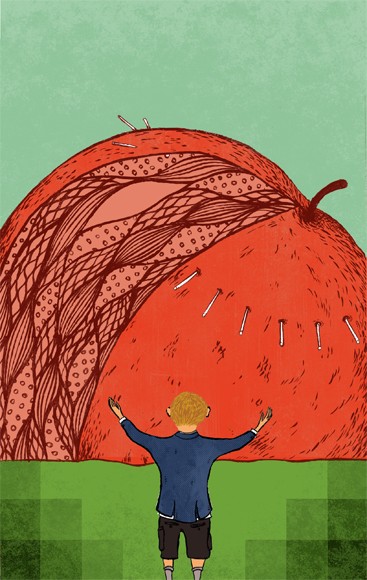
 

1. Make It Gigantic 


“Apple” by Benjamin Carr

He may be interested in the psychological effects of objects, not in their accurate portrayal, and may want, for example, to fill his canvas with a single apple so as to give it a singular power and presence, the way Georgia O’Keefe painted flowers “as if they were skyscrapers.” Picture a red apple completely filling a canvas all the way to the edges and feel through what psychological effects that image might have on a viewer.


2. Make It The Important Detail


Picasso often lamented, perhaps tongue-in-cheek, that viewers never realized that the peach in the painting they were viewing was not a detail but its very reason for being. “The whole painting is for the sake of that peach!” he would cry. Your painting may include many things but it may be the apple that really matters to you and that you intend to make matter to a viewer — the very reason, in short, you painted that painting.

3. Alter It Slightly or Completely

You may decide to alter the apple’s look for artistic, psychological, social, philosophical or spiritual reasons, making it surrealistically weep, presenting it as solid as a rock as everyman’s fruit (think of Van Gogh’s “Potato Eaters”), giving it a wispy look as an object in Heaven, and so on. 


 Mondrian’s “Apple Tree in Flower”

Or you may alter it so radically and drastically that it becomes a cubist fantasy, Mondrian-like, or otherwise completely unrecognizable. To get a sense of this process of altering you might track the many studies that Mondrian made as he further and further abstracted an apple tree until its final incarnation (see, for instance, his “Apple Tree in Flower” as one example).

4. Show Off Your Skills

An artist may want to display his skills and produce super-realistic objects that allow him to demonstrate how he can handle the folds of drapes, the sheen on grapes, or the rust on fire escapes. In part he is aiming for a psychological effect and in part he is simply showing that he is good at what he does. Think in this regard of an artist like Fantin-Latour and his 1861 painting “A Plate of Apples” or the contemporary Canadian painter Mina dela Cruz’s “Rojo y Verde.”


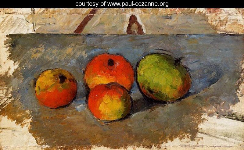
5. Give Us An Impression 


 “Four Apples” by Paul Cezanne

Impressionism proved that fleeting glimpses of objects provide as big a punch as those objects fully rendered in lifelike fashion. There is the “real” Rouen Cathedral and then there are Monet’s impressions of it. Imagine rendering an apple in the style of “Rouen Cathedral, Façade (Morning Effect).” It would still be an apple — but might look more like an iced version of itself!

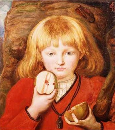
6. Use It In A Narrative


 “William Tells Son” by Ford Madox Brown

 The apple may have its place, and get its look, as part of the narrative an artist is telling: as, for example, as part of a Garden of Eden or William Tell narrative painting. In the first painting it might need to look particularly delicious, in the second painting frightening by virtue of being hard to see (and hard to hit). Consider, as one example of the narrative use of an apple, Ford Madox Brown’s painting called “William Tell’s Son,” which shows a young boy holding an arrow-cleaved apple.


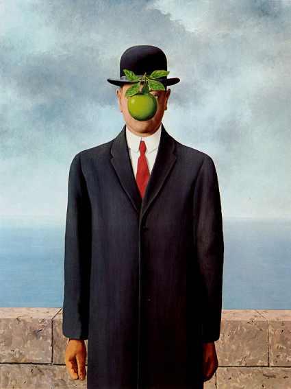
 7. Use It Suggestively


“The Son of Man” by Rene Magritte  


What might an apple suggest? Rosiness? Health? Youth? Beauty? Might it suggest a simpler time, a quieter place, and a romantic idealization of America? Objects have cultural connections and artists can use them suggestively to put the viewer in mind of whatever it is the artist intends. To take one example, consider the following phrase: “He’s a bad apple.” In our culture, we understand what that phrase means—and how an artist might use an apple suggestively to portray evil.

The professional artist doesn’t just “see an apple” and rush off to render it. He has intentions. The better you understand your intentions as an artist, the less trouble you will have knowing “what to do with” the objects of the world.

Friday 4 December 2015

Grade 10 Art - Day 57 "Synesthesia"

Building upon our discussion from yesterday, where we learned about a man who hears colours through a chip that was implanted into the back of his head, today we learn about synesthesia.

Simply put, synethesia is a "neurological trait that combines two or more senses".  Imagine being able to taste colour!

Let's watch this video that explains how it works:


Diagnosis

Although there is no officially established method of diagnosing synesthesia, some guidelines have been developed by Richard Cytowic, MD, a leading synesthesia researcher. Not everyone agrees on these standards, but they provide a starting point for diagnosis. According to Cytowic, synesthetic perceptions are:

Involuntary: synesthetes do not actively think about their perceptions; they just happen.

Projected: rather than experiencing something in the "mind's eye," as might happen when you are asked to imagine a color, a synesthete often actually sees a color projected outside of the body.

Durable and generic: the perception must be the same every time; for example, if you taste chocolate when you hear Beethoven's Violin Concerto, you must always taste chocolate when you hear it; also, the perception must be generic -- that is, you may see colors or lines or shapes in response to a certain smell, but you would not see something complex such as a room with people and furniture and pictures on the wall.

Memorable: often, the secondary synesthetic perception is remembered better than the primary perception; for example, a synesthete who always associates the color purple with the name "Laura" will often remember that a woman's name is purple rather than actually remembering "Laura."

Emotional: the perceptions may cause emotional reactions such as pleasurable feelings.

Who has it?


Estimates for the number of people with synesthesia range from 1 in 200 to 1 in 100,000. There are probably many people who have the condition but do not realize what it is.

Synesthetes tend to be:


Women: in the U.S., studies show that three times as many women as men have synesthesia; in the U.K., eight times as many women have been reported to have it. The reason for this difference is not known.

Left-handed: synesthetes are more likely to be left-handed than the general population.

Neurologically normal: synesthetes are of normal (or possibly above average) intelligence, and standard neurological exams are normal.

In the same family: synesthesia appears to be inherited in some fashion; it seems to be a dominant trait and it may be on the X-chromosome.
Famous People

Some celebrated people who may have had synesthesia include:

Vasily Kandinsky (painter, 1866-1944)
Amy Beach (pianist and composer, 1867-1944)
Olivier Messiaen (composer, 1908-1992)
Charles Baudelaire (poet, 1821-1867)
Franz Liszt (composer, 1811-1886)
Arthur Rimbaud (poet, 1854-1891)
Richard Phillips Feynman (physicist, 1918-1988)
Mary J. Blige (singer, songwriter, 1971-)

It is possible that some of these people merely expressed synesthetic ideas in their arts, although some of them undoubtedly did have synesthesia.

The Biological Basis of Synesthesia


Some scientists believe that synesthesia results from "crossed-wiring" in the brain. They hypothesize that in synesthetes, neurons and synapses that are "supposed" to be contained within one sensory system cross to another sensory system. It is unclear why this might happen but some researchers believe that these crossed connections are present in everyone at birth, and only later are the connections refined. In some studies, infants respond to sensory stimuli in a way that researchers think may involve synesthetic perceptions. It is hypothesized by these researchers that many children have crossed connections and later lose them. Adult synesthetes may have simply retained these crossed connections.


It is unclear which parts of the brain are involved in synesthesia. Richard Cytowic's research has led him to believe that the limbic system is primarily responsible for synesthetic experiences. The limbic systemincludes several brain structures primarily responsible for regulating our emotional responses. Other research, however, has shown significant activity in the cerebral cortex during synesthetic experiences. In fact, studies have shown a particularly interesting effect in the cortex: colored-hearing synesthetes have been shown to display activity in several areas of the visual cortex when they hear certain words. In particular, areas of the visual cortex associated with processing color are activated when the synesthetes hear words. Non-synesthetes do not show activity in these areas, even when asked to imagine colors or to associate certain colors with certain words.

A student directed me to the following article that is worth a read!
http://www.dazeddigital.com/artsandculture/article/28353/1/the-artist-who-battled-for-his-whole-life-hearing-colours

Source: https://faculty.washington.edu/chudler/syne.html